First impressions are everything, especially when it comes to conducting business online. The tiny details matter just as much as the big picture.
With customer expectations higher than ever, it’s all the more important to maximize every touchpoint, especially those that see the most traffic—like your website. That’s where splash pages come in.
A splash page is a page that visitors see before exploring the rest of your website. (But it’s different than a landing page—more on that below.) It can help you say all the things you need to say right before someone clicks through to your homepage. It’s kind of like what a prologue is to a book.
But splash pages aren’t right for every website.
Think about it like this: if there’s information your visitors need to know before entering your site, a splash page could be a great option. If there isn’t, you might just be creating an unnecessary obstacle.
When to Consider Using a Splash Page
We know that splash pages come before a homepage. But what are they used for exactly?
The function of a splash page varies. You can use them to promote a product or service, communicate important information, advertise a discount, put up an age verification gate, and more.
Though the reasons for using a splash page vary, they all have some consistent elements:
- Links to (and away from) the main website
- Succinct copy (with a clear call to action)
- Limited visual elements
- One message or call to action
It’s important to note that (unlike landing pages) splash pages are part of your main website—not a separate entity. Think of splash pages the doorman that stands outside your brick-and-mortar and first greets visitors.
So why would you use a splash page?
Splash pages have all kinds of use cases for lots of different businesses. You might use one to:
- Communicate key information to visitors (like a disclaimer or warning)
- Verify your visitors’ age or their preferred language
- Configure someone’s server, viewing mode, and site requirements (like choosing between a low-bandwidth and high-bandwidth version of the site)
- Collect visitors’ contact information or other personal details
- Promote an event or sale you’re running, or offer visitors a discount
- Prompt visitors to turn on their sound (if you’ve got some background tunes or a video you want them to hear)
If your website is optimized for user variables like region, language, or age, splash pages also let visitors select the site that works best for them. Remember the usage rule of thumb: if there’s something you’d like to communicate before someone enters your site, a splash page could be a smart idea.
But wait—how are splash pages different from landing pages, exactly?
We’re so glad you asked.
The Difference Between Splash Pages and Landing Pages
Though they sound similar, splash pages and landing pages are entirely different animals. While splash pages are windows that convey limited (but necessary) information before a visitor enters a website, landing pages are dedicated web pages that stand entirely separate from your site.
Landing pages are used in marketing or advertising campaigns to get visitors to complete an action. The name can be attributed to users landing on the page after clicking on a link from an email, a social media post, or even another website. In other words, landing pages are designed to be high-converting pages, while splash pages take on more of a superstore greeter role.
Common elements of a landing page include (but aren’t limited to):
- Headline
- Copy
- Images
- Call to action
- Unique URL
Also, because landing pages encourage visitors to perform a specific action, they typically don’t have navigation bars. That way they don’t distract visitors from your primary CTA.
There are two main archetypes of landing pages you can choose from, depending on your goal: lead generation pages and click-through landing pages. Lead generation landing pages capture potential leads for your business, while click-through landing pages take customers straight to a checkout or signup page or even the app store.

The bottom line: splash pages and landing pages serve different (yet essential) functions.
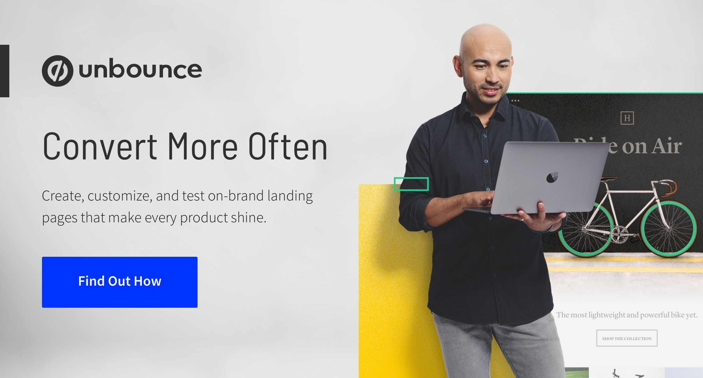
“I think I need a landing page instead of a splash page.” Unbounce’s drag-and-drop buildier lets you create one quickly, without the help of a developer. Learn more about why you’d build one to support your marketing goals here.
9 Splash Page Examples
Ready to see this in action? Let’s take a look at some of the best examples of splash pages we’ve seen in the wild.
1. Ikea
When you navigate to the Ikea website, you get a friendly greeting and the opportunity to choose which site you’d like to view based on your location. The function it serves is immediately apparent, reducing the time it takes for visitors to get to the good stuff in their region (like that sweet Hemnes bookshelf that’s on sale).
This splash page looks very similar to the homepage, which keeps the look and expectations consistent. The clean, straightforward design (coupled with a clear call to action and headline) makes this a great example of user experience.

There’s a surprising attention to detail here, too. The “why am I seeing this?” link explains to visitors why they’re on the splash page in the first place. (Always a smart practice.) And there are also alternate links so users can find more information on what Ikea’s up to.
2. Bell’s Brewery
If you’ve ever visited the website of your favorite brewery or winery, you’ve likely seen one of these:

That’s right—the good ol’ age verification window is acting as a splash page. (It’s like getting carded, but virtually.) The purpose of this gate is pretty clear: to verify that you are of the legal age in your country to access this content (and maybe purchase products from the site).
This splash page from Bell’s Brewery is simple, from the design to the copy to the call to action. The page feels a bit like a popup welcome mat, but you can’t click out of it. The blurred homepage in the background reinforces a focus on the age verification form. Visitors can easily type in their age and are instantly granted access to the website upon doing so.
Molson is another example where we see a splash page used for age verification. In this case, it’s even larger (and features design elements that blend well with the rest of the site).

3. Casa
Casa offers a variety of home goods to shoppers in several different countries. As you can see, they use a splash page to direct new visitors to the language-appropriate version of their website.

By having shoppers select their country on the splash page, they can be sure to offer up the most optimal (and native) experience to visitors, no matter where they live or what language they speak.
4. Yul Moreau’s Portfolio
Yul Moreau is a creative director and this is his portfolio site. The splash page gives visitors a glimpse of his personality as well as his experience.

Complete with electronic music and a mandatory scroll function (it literally says “scroll or die,” though we’re pretty sure he doesn’t mean it) to access the rest of the site, this splash page does an excellent job of capturing Yul Moreau’s attitude—and the kind of art director he is.
5. Poolside.fm
This funky, 90s-inspired mock-radio station quite literally puts the “splash” in splash pages. From the moment users navigate to the site, they’re immersed in another decade—from the play on a DOS system bootup to the period-specific tunes. It’s a fun, interactive site from the start.


This splash page sets the tone for what users can expect from this site. Then—clearly inspired by Mac OS 8—the home page looks like a desktop. Visitors can click on the different icons to explore the site. They can even leave a comment in the Guest Book, discover music, connect with Poolside.fm on social media, and learn more about the meaning behind this eccentric site.
6. Forbes
Love it or hate it, for years business publication Forbes has directed new site visitors to a “Quote of the Day” splash page (or welcome mat) featuring an appealing thought or idea before an article.

The monochromatic design is uncluttered, but the material on the splash page varies. Sometimes it’s just the quote, while other times an ad is displayed or other articles are promoted in list form (both of which work toward brand initiatives of driving up overall site clicks).
7. Clearly
In this splash page example from Clearly (an online retailer of contact lenses, eyeglasses, and sunglasses), we can see how sometimes splash pages offer a few options to silo the experience for different types of buyers. This is a good idea if you’re looking to simplify the navigation of your site for first-time visitors.

In Clearly’s case, starting from the splash page, site visitors are directed to four key locations on the site, as well as the option to view in French (for customers in Quebec). This eliminates any confusion around where to find their key offerings and resources.
8. Legwork Studio
A now-defunct creative shop based out of Denver, Colorado, Legwork Studio wanted a way to show potential customers and fans alike that they had closed their doors for good. It’s an entire experience before you visit the site itself.

The blunt message lets users know all they need to know from the moment they arrive. Once the full site loads, users will see three cards that they’re able to click on to learn more about Legwork Studio and the kind of work they once did for their clients. RIP, Legwork.
9. In Pieces
Last but certainly not least, we have In Pieces, a website created by Bryan James. The site raises awareness of 30 endangered animal species, but it’s also an experimental coding project.

When users navigate to the site, they see simple text and two calls to action: one to explore the site, and one to switch your browser to Google Chrome so you can enjoy the full experience before entering.
A splash page may or may not be the right option for your site. But if you’re looking for landing pages for your marketing campaigns, Unbounce can help.
Using the drag-and-drop builder, you can create the high-converting landing page of your marketing dreams. Learn more here.