Over the years, Titan PPC, a full-service pay-per-click advertising agency based in Vancouver, has developed a “magic formula” for designing lead generation landing pages that convert at average of 15% or higher.
1. Make your landing pages relevant
Any smart marketer knows that when visitors reach a landing page, they won’t all have the same intentions for being there. Some may have clicked an ad looking for a plumber in West Seattle where others may have clicked one looking for a plumber in Capitol Hill.
But if your client is a plumbing company that serves the entire Seattle metropolitan area, your landing page should show both the visitors from West Seattle and Capitol Hill that you’ve got the service they need in the location they want it.
In other words, you want to use geo-targeting to make your landing pages especially relevant to your prospects. Patrick Schrodt, founder of Titan PPC explains:
There’s always been geo-based searches and there always will be. For our own campaigns, we’ve gone as targeted as including a map on every landing page. We highlight a visitors location on the map depending on the where their search is coming from — people go crazy for it!
Watch this video with Patrick to hear how Titan PPC used geo-targeting to increase a client’s on-page conversion rates from 6% to 33%, practically overnight.
2. Use (awesome) images to break up your body copy
When a prospect reaches your lead gen landing page, the first thing they’ll do is judge your offer or product by the way you’ve presented it to them. And they’ll do it within seconds.
That’s why you want to make sure it looks so good they won’t want to leave.
The key to keeping prospects interested? Great photography. According to Patrick, “Images help prospects get a clear picture of your client’s product or offer, and it shows them you’re a professional.”
That’s why Titan PPC adds full-page horizontal image galleries throughout their lead gen landing pages: “It helps break up a visitor’s attention as they scroll by giving them something nice to look at.”
But you can’t just slap a bunch of images into a gallery and hope that it all comes together. “If you’re going to source images for clients, you have to make sure you grab photos from a series. I’ve seen landing pages where it’s obvious that each image belongs to a different suite and it’s not coherent or nice to look at.”
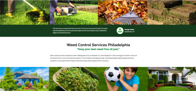
Check out this example of cohesive image galleries on one of Titan PPC’s lead gen landing pages for a lawn mowing client in Philadelphia:

3. Remind visitors why they are on your page
For Titan PPC, the best way to do that is by adding a smooth scroll call-to-action (CTA) bar right below the horizontal image gallery.
Why? Because it brings a prospect right back to where you want them: the form. “It works because every time a visitor sees something visual and eye catching [like the image galleries], they’re then prompted to fill out the form,” says Patrick.
4. Make the form match the offer
The design of a form on your landing page should never be an afterthought. That means weighing, measuring and sifting every item from the questions to the CTA so it’s fully optimized to ensure a conversion. “It’s so key that the form matches the offer,” says Patrick. “Otherwise a prospect will just be turned off.”
So if you’re offering a 100% free quote on plumbing services, then the form on your landing page should reiterate, loud and clear, that the offer comes at no price. Sounds pretty straight-forward, doesn’t it?
But matching a form to an offer also means making sure you have a solid understanding of your target audience. Patrick explains: “For real-estate clients, the CTA is always to download a free floor plan. But for clients that are service based, like plumbers or roofers, the CTA is always to get a free quote.”
It all comes back to personalization: different types of prospects want to see different kinds of offers. According to Patrick, real-estate prospects want the feeling of exclusivity, whereas service-seeking prospects are probably just looking for the cheapest way to fix a runny faucet or leaky roof.
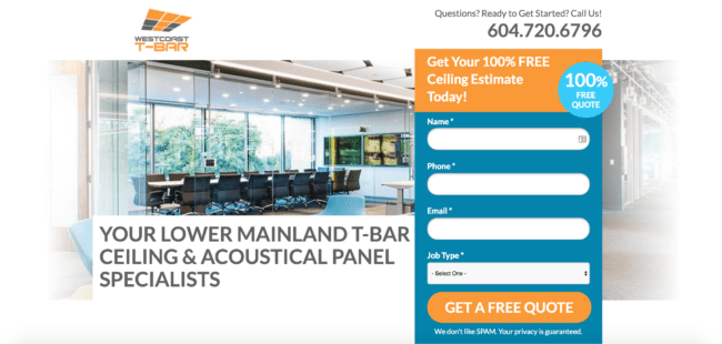
Titan PPC’s last tip for optimizing the form? Make the form catch your prospect’s attention.
We always put a starburst or icon in the corner of the form. It’s usually something like ‘100% free’ so it pulls a visitor in and reminds them why they want to fill it out!”
Here’s a page designed by Titan PPC that illustrates what Patrick means:

From showing your visitors ultra-relevant content to making sure that content has awesome design and flow, the landing page magic formula is all about giving prospects exactly what they’re looking for and expecting to see when they land on your page.